
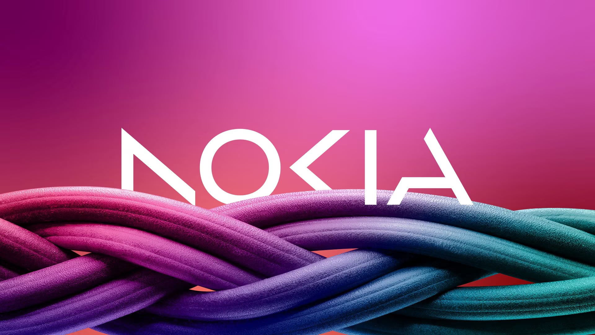
The new logo comprises five different shapes forming the word NOKIA. The iconic blue colour of the old logo has been dropped for a range of colours depending on the use.
Nokia announced plans on Sunday to change its brand identity for the first time in nearly 60 years, complete with a new logo, as the telecom equipment maker focuses on aggressive growth. The new logo comprises five different shapes forming the word NOKIA. The iconic blue colour of the old logo has been dropped for a range of colours depending on the use.
“There was the association to smartphones and nowadays we are a business technology company,” Chief Executive Pekka Lundmark told Reuters in an interview.
He was speaking ahead of a business update by the company on the eve of the annual Mobile World Congress (MWC) which opens in Barcelona on Monday and runs until March 2.